AQRE ADVISORS

Commercial Real Estate | Royal Oak, Michigan

THE SITUATION

A start up, boutique brokerage with knowledge and passion in the commercial real estate world, the two owners of AQRE Advisors knew they had a way to make the process of selling and buying better and faster.

To hit the ground running, they wanted a brand that was established and that gave off an air of bigger than it was. They came to us with a name, but a loose concept of what it could stand for, but needed structure and creative purpose behind it.

Not only did they want the brand to speak to CRE buyers and sellers, but to new talent. Young, motivated, go-getter, and passionate people.

THE WORK WE DID

  • Facilitated a workshop where we discovered their brand archetype, personality traits, and key differentiators.

  • Business messaging including mission, vision, core values, and purpose.

  • Provided creative direction for the logo design.

  • Tested the name “AQRE” to a specific audience.

THE IMPACT OF THE WORK

  • The brand book was used by their web development team, it gave them messaging and creative direction.

  • The brand platform gave their new marketing team direction, clarity and consistency.

  • The clients felt confident and clear with their brand and were able to easily implement it to their building design, onboarding process, and collateral.

  • A sense of consistency throughout their sales process and follow-up, how they were showing up for their clients.

Brand Strategy

Brand Platform

Consumer Study

Brand Identity

Creative Direction

Name Testing

FROM THE BRAND BOOK

Page from a brand book discussing theme inspiration with colorful images of nature patterns, digital stock market data, bees on honeycomb, a drone, modern architecture, and natural textures.
Page from a booklet titled 'What Makes AQRE Advisors Different?' highlighting the company's key qualities: extensive experience, focus on client interests, quality over quantity, and creative vision for real estate, with sections explaining each aspect.
A promotional flyer with a green and white color scheme, titled 'Brand Promise' and 'Powered by why.' The flyer outlines key questions for business branding, emphasizing asking the right questions, understanding client goals, improving practices, and challenging the status quo.
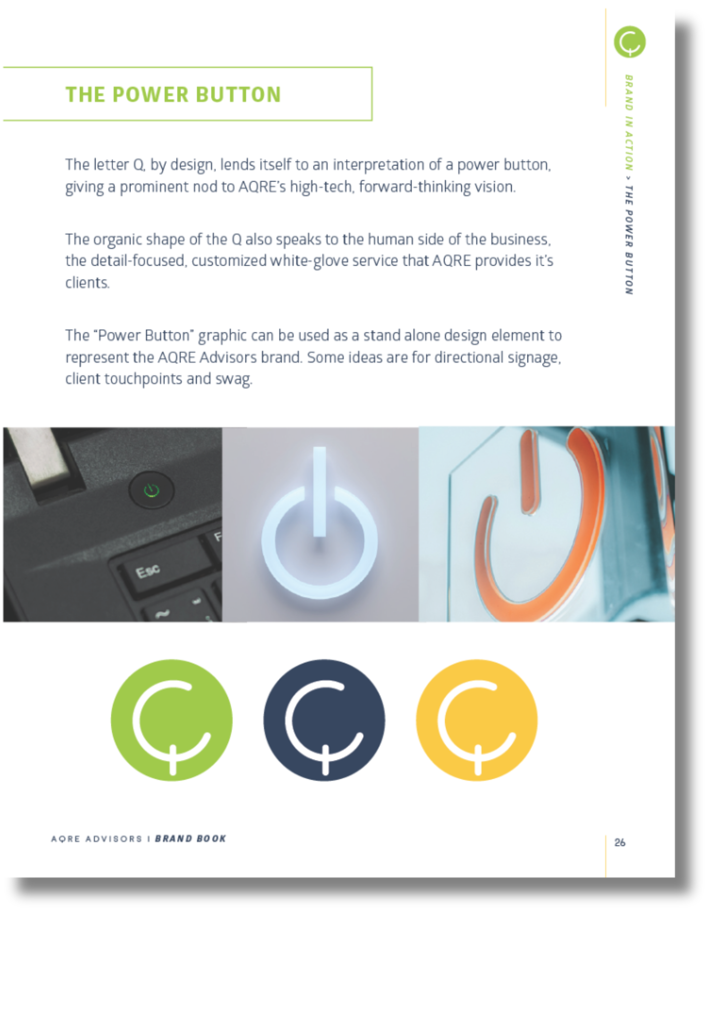
Page from a brand book explaining the power button design, showing three stylized power buttons in green, navy, and yellow, along with images of actual power buttons on devices.

BRAND IMPLEMENTATION

Exterior of a modern office building with blue signs for Acre Advisors and Symmetry Management, with parking and residential buildings in the background.
Laptop screen displaying a webpage for AQRE, a commercial real estate specialist, with images of modern buildings and text about client-centric advice, forward thinking, comprehensive strategies, and cutting-edge technology.
Branded merchandise and office supplies for Acre Advisors, including a navy polo shirt, coffee mug, business card, green spiral notebook, and pen all featuring the Acre Advisors logo.
Logo for Acre Advisors with stylized green and blue text reading 'Acre Advisors' and a graphic split into green and blue sections, featuring the name's acronym in a modern font.

SEE MORE OF OUR WORK